Discussion
Loading...

Post

  • Log in
  • Sign up
  • About
  • Code of conduct
  • Privacy
  • Users
  • Instances
  • About Bonfire
Information Is Beautiful
@infobeautiful@vis.social  ·  activity timestamp 3 months ago

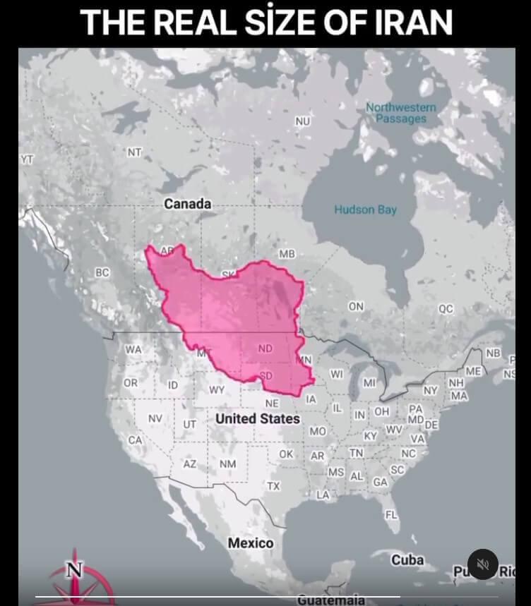
The real size of Iran

by @the.world.in.maps
made using https://thetruesize.com

A map titled "THE REAL SIZE OF IRAN" shows the outline of Iran, colored bright pink, overlaid onto the map of North America. The shape of Iran is positioned over the central United States and a part of Canada, with its borders stretching across multiple states and provinces, including North Dakota, South Dakota, Nebraska, Minnesota, and others, illustrating a scale comparison. The map also labels the United States, Canada, Mexico, Hudson Bay, and the Northwestern Passages for geographical context.
  • Copy link
  • Flag this post
  • Block
CEFurby
CEFurby
@cefurby@alaskan.social  ·  activity timestamp 3 months ago

@infobeautiful The Iran map is using a Mercator projection, which preserves angles but distorts area. A projection that preserves area would communicate better (more beautifully)

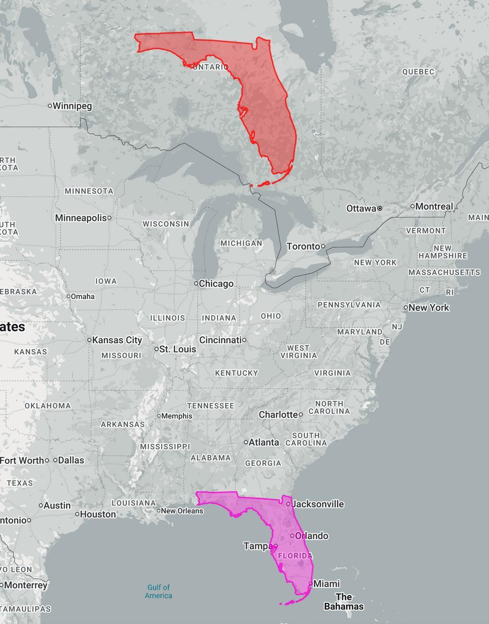
Your source shows a relatively accurate size comparison (projection on a projection). Presentng it in Mercator makes it more dramatic, but inescapably misleads the viewer as to relative area within the map. eg. this Florida - Florida map from your source.

#map #size #comparison #USA #Canada #Florida #Iran

A map showing eastern USA and southeastern Canada, with Florida highlighted in pink where it is located geographically, and a larger Florida highlighted in red superimposed on the map above the Great Lakes.
  • Copy link
  • Flag this comment
  • Block
derknopf
derknopf
@derknopf@punkstodon.de  ·  activity timestamp 3 months ago

@infobeautiful theorema egregium saying hello 😁 maps are funny sometimes

  • Copy link
  • Flag this comment
  • Block
Instance logo
bonfire.cafe
Log in Create account
Banner for bonfire.cafe

bonfire.cafe

A space for Bonfire maintainers and contributors to communicate

bonfire.cafe: About · Code of conduct · Privacy · Users · Instances
Bonfire bovenjan · 1.0.3-alpha.10 no JS en
Federation disabled
Instance logo
  • Explore
  • About
  • Members
  • Code of Conduct

Install bonfire.cafe

Get the full app experience

1 Tap Share 2 Add to Home Screen