Our new For You algorithm is pretty complex, so we created this infographic to make it easier to understand!
#Loops #ForYou #TikTok #EthicalAlgorithms
Post


@loops 😞 please try harder with the alt text next time. lots of effort clearly went into this graphic


@hipsterelectron @loops
> lots of effort clearly went into this graphic
it's AI-generated. check the watermark in the bottom right corner.
@noodlejetski no fucking way lmao
@noodlejetski i was trying to be nice at the absolute limit of my patience and yet
@hipsterelectron@circumstances.run We updated the alt text with a better description:
How the Loops For You Algorithm works, it visualizes how the platform selects videos for users when using the For You feed.
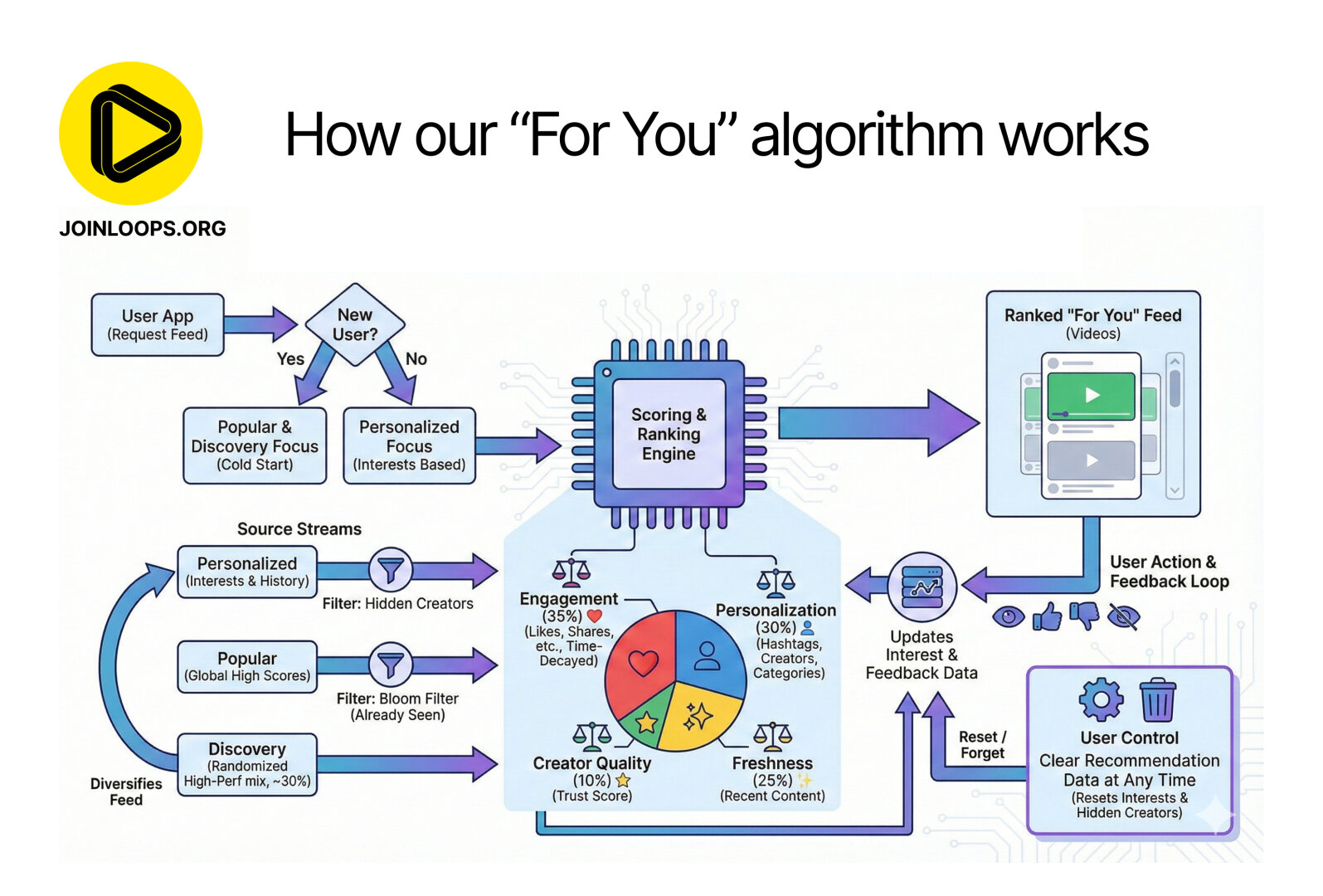
It shows a flowchart starting from a user request, branching based on whether the user is new (receiving a "Popular & Discovery Focus") or returning (receiving a "Personalized Focus"). Three content sources—Personalized, Popular, and Discovery streams—are filtered for hidden creators or already-seen content and fed into a central Scoring & Ranking Engine chip icon. Below this engine, a pie chart details the scoring weights: Engagement (35%), Personalization (30%), Freshness (25%), and Creator Quality (10%). The engine outputs the final "Ranked 'For You' Feed." A feedback loop shows user actions updating interest data for future recommendations. A prominent section in the bottom right emphasizes User Control with a trash can icon, stating users can "Clear Recommendation Data at Any Time (Resets Interests & Hidden Creators).
How the Loops For You Algorithm works, it visualizes how the platform selects videos for users when using the For You feed.
It shows a flowchart starting from a user request, branching based on whether the user is new (receiving a "Popular & Discovery Focus") or returning (receiving a "Personalized Focus"). Three content sources—Personalized, Popular, and Discovery streams—are filtered for hidden creators or already-seen content and fed into a central Scoring & Ranking Engine chip icon. Below this engine, a pie chart details the scoring weights: Engagement (35%), Personalization (30%), Freshness (25%), and Creator Quality (10%). The engine outputs the final "Ranked 'For You' Feed." A feedback loop shows user actions updating interest data for future recommendations. A prominent section in the bottom right emphasizes User Control with a trash can icon, stating users can "Clear Recommendation Data at Any Time (Resets Interests & Hidden Creators).
@loops ❤️❤️❤️❤️❤️ thanks so much!!


@hipsterelectron @loops I'm not even sure how you'd do a complex flowchart type diagram justice with alt text. It seems like you'd really want a textual write-up of the concepts, but that's a much bigger task than alt-text for an image.
I guess you could just copy all the text, label each block with numbers, and write down a list of arrows between nodes. But that doesn't sound all that easy to read..